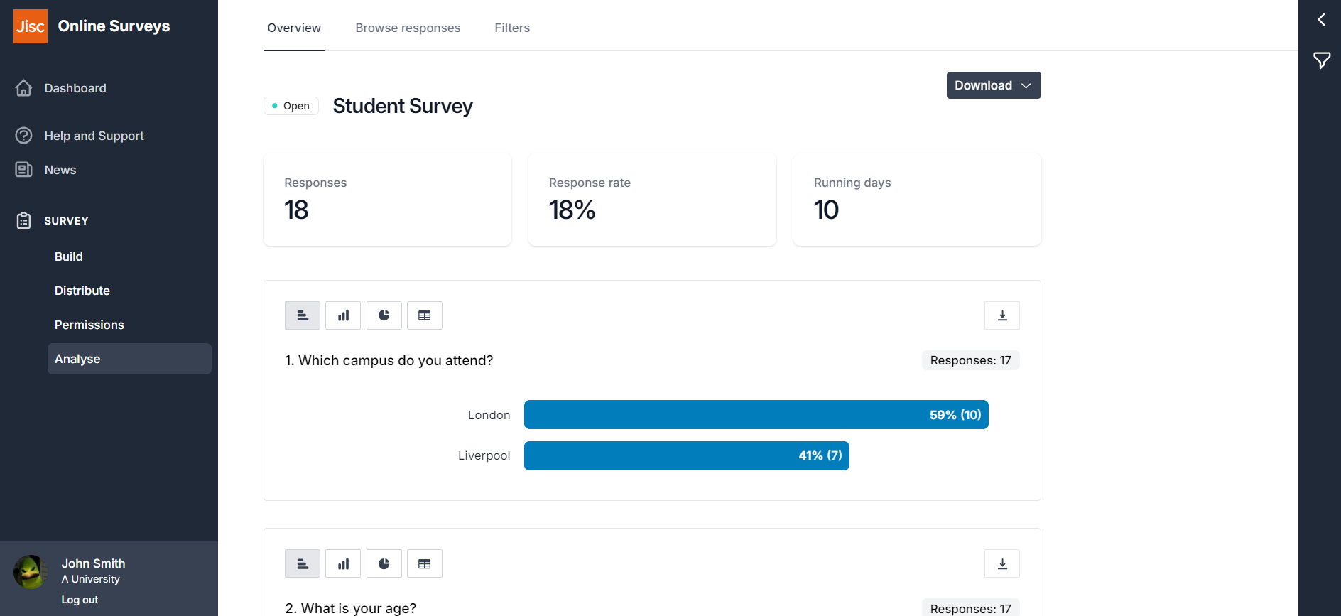
Once you have launched your survey, you are able to start analysing responses as soon as they come in.
Navigate to the Analyse area of your survey by choosing Analyse on the sidebar menu.
As a default, you’ll be taken to the Overview page, which contains charts for each of your questions and had tools for you to filter or export your responses.
Charts and tables
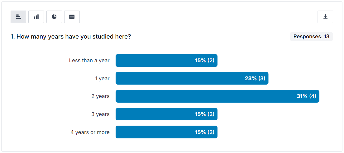
Horizontal bar chart
A horizontal bar chart is displayed as the default for Choice, Dropdown and Grid questions.
For choice or grid questions that allow multiple answers, the percentages are calculated by how many of your respondents chose that individual answer option.
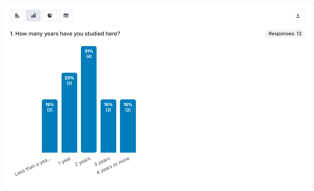
Vertical bar chart
A vertical bar chart can be displayed for Choice, Dropdown and Grid questions.
If your question contains more than 12 answer options, then this chart will not be available to display.
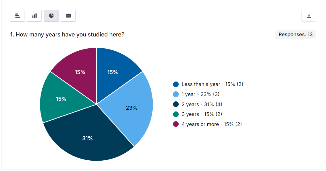
Pie chart
A pie chart can be displayed for Choice, Dropdown and Grid questions.
If you question contains more than five answer options, then this chart will not be available to display.
Hovering over the an answer option on the pie chart’s key will expand the related slice.
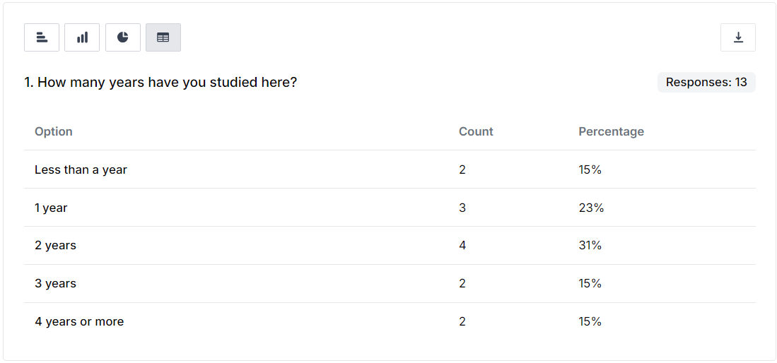
Table
A table can be displayed for Choice, Dropdown and Grid questions.
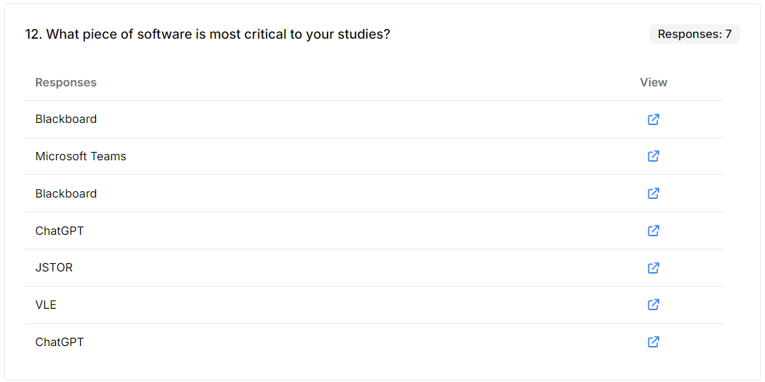
Free-text answers
Answers to multi-line and single-line free-text questions are shown in their own scrollable display.
You can choose how many answers to view in one go using the the buttons at the top of the display.
Each answer contains a link through to the individual response, so you can instantly see the other answers the respondent made in the survey, to provide some context to their free-text response.
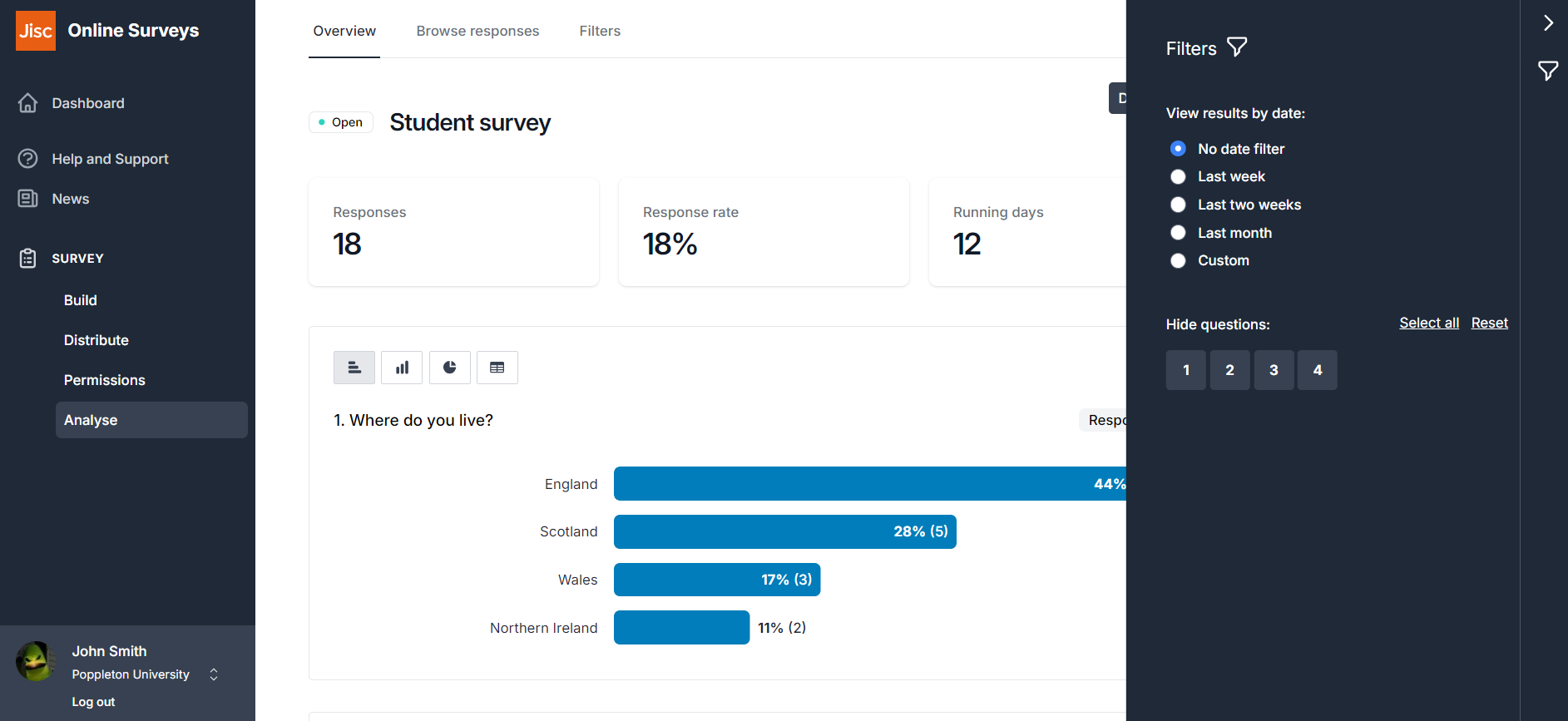
Filtering your responses
You can filter your survey responses by:
- Response date
- Question number
- Answers given by respondents
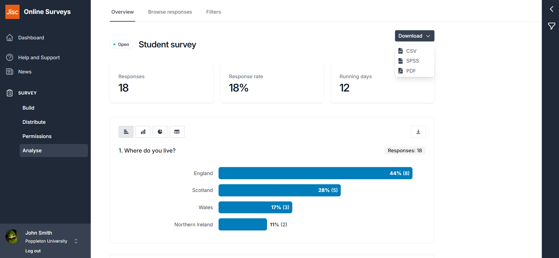
Downloading your responses
You can download your responses in three formats:
- CSV: for analysis in a spreadsheet or statistical software
- SPSS: to import into IBM’s SPSS statistics software.
- PDF: a rendering of your summary for offline reference.
Further help and support
Viewing individual responses
This help page details how to find and view individual responses to your survey.
Read MoreStatistics
This help page explains how view and understand statistics for quantitative questions.
Read MoreFiltering survey responses
This help page instructs you how to apply filters to your response data.
Read MoreDownloading your responses
This help page details how to download your survey's response data.
Read MoreDownloading a PDF of your results
This help page details how to download a PDF of your Analyse Overview
Read MoreDeleting a response
This help page instructs you how to find and delete an individual response.
Read MoreCalculating your response rate
This help page details how to find and determine your survey's response rate
Read More