We’re excited to welcome some changes to our Analyse Overview page, based on our UX team’s research and your feedback.
We’ve redesigned our charts to make them more readable and more accessible.
We’ve added a download button to each chart, so you can export an image of the chart to use in reports and presentations.
We introduced an SPSS export to our Download options, so you can easily import your survey data into IBM’s SPSS statistical software. (Learn more about downloading responses.)
How we've redesigned our charts
We’ve redesigned each of our charts to make them more compact, readable and consistent. Here’s what has changed:
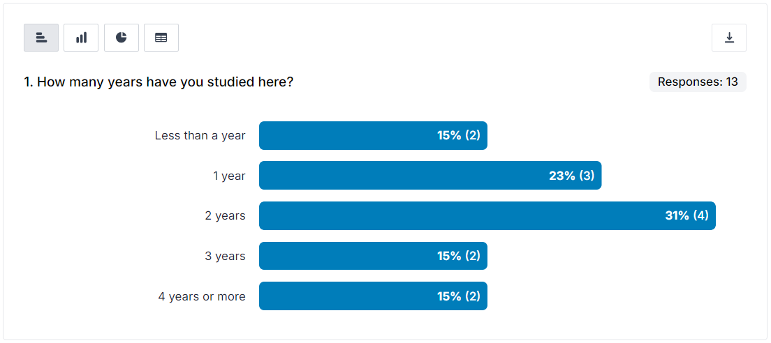
Horizontal bar charts
Thinner bars with a consistent width, regardless of the number of answer options, so that charts are more compact and easier to read.
More space for labels so there is less need for truncation of text.
Both percentages and counts are displayed in the bars, so there is no need for axes and grids to clutter up the chart.
A consistent colour for bars to make the charts easier on the eye and not imply something unintended by a range of colours.
An ability to expand and contract charts with lots of bars, so you can minimise page-hoggers while you look at other questions.
A downloadable image of the chart.
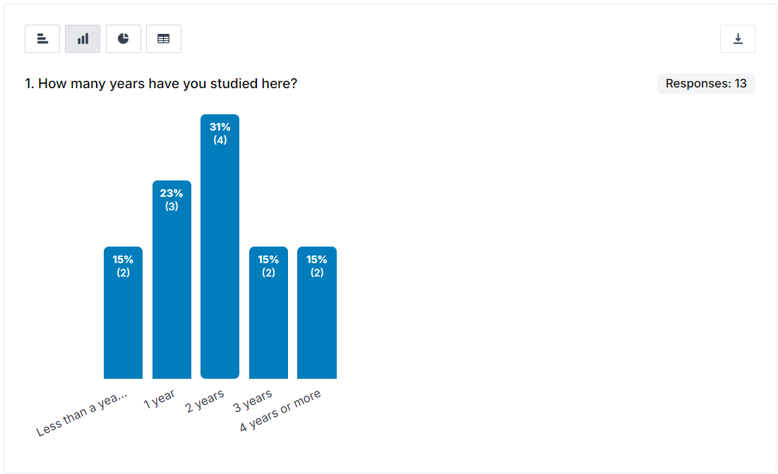
Vertical bar charts
Answer options now appear left-to-right in the order they appear in the survey (no longer sorted most-to-least responses), to provide consistency.
Vertical bars will only be displayed for questions with 12 or fewer answer options, to ensure the chart is readable and to do away with the need of an aggregate “Other” column.
Thinner bars with a consistent width, regardless of the number of answer options, so that charts are more compact and easier to read.
Both percentages and counts are displayed in the bars, so there is no need for axes and grids to clutter up the chart.
A consistent colour for bars to make the charts easier on the eye and not imply something unintended by a range of colours.
A downloadable image of the chart.
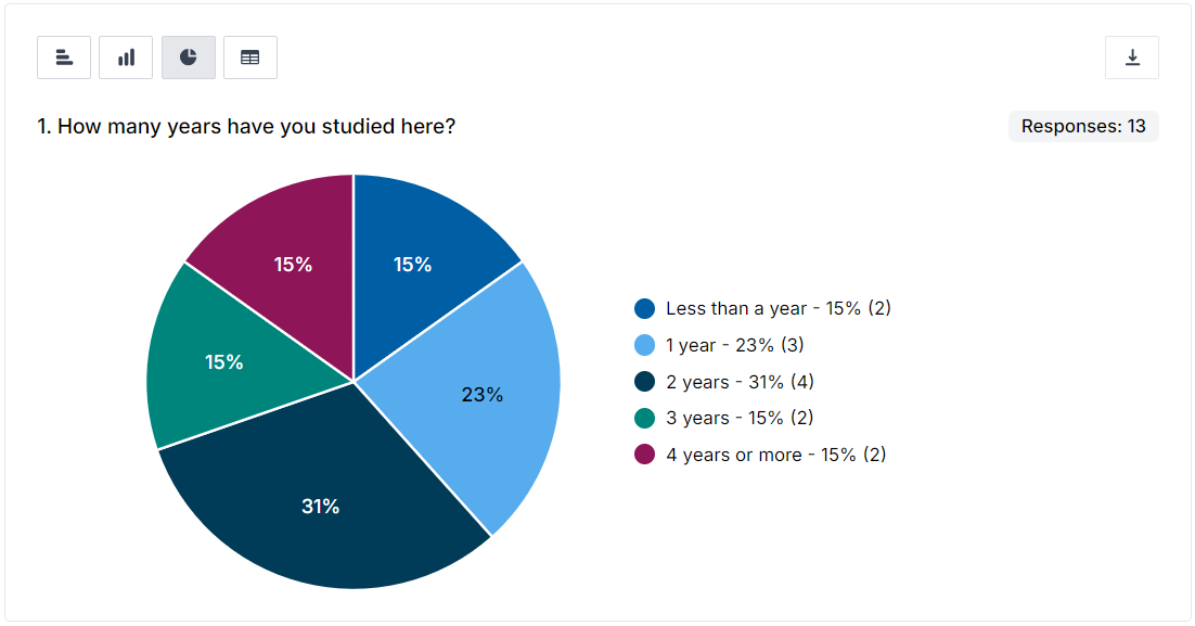
Pie charts
Pies will only be displayed for questions with five or fewer answer options, to conform with best practice and ensure they are always readable.
Repositioned interactive key. Hover over the answer option in the key to expand the related segment.
New accessible colours.
A downloadable image of the chart.
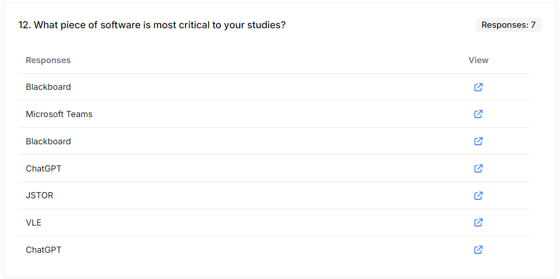
Free-text responses
More compact display of free-text answers so there is less scrolling.
Removed cluttering “View response” text link and replaced it with a less obtrusive View icon.